Gantt
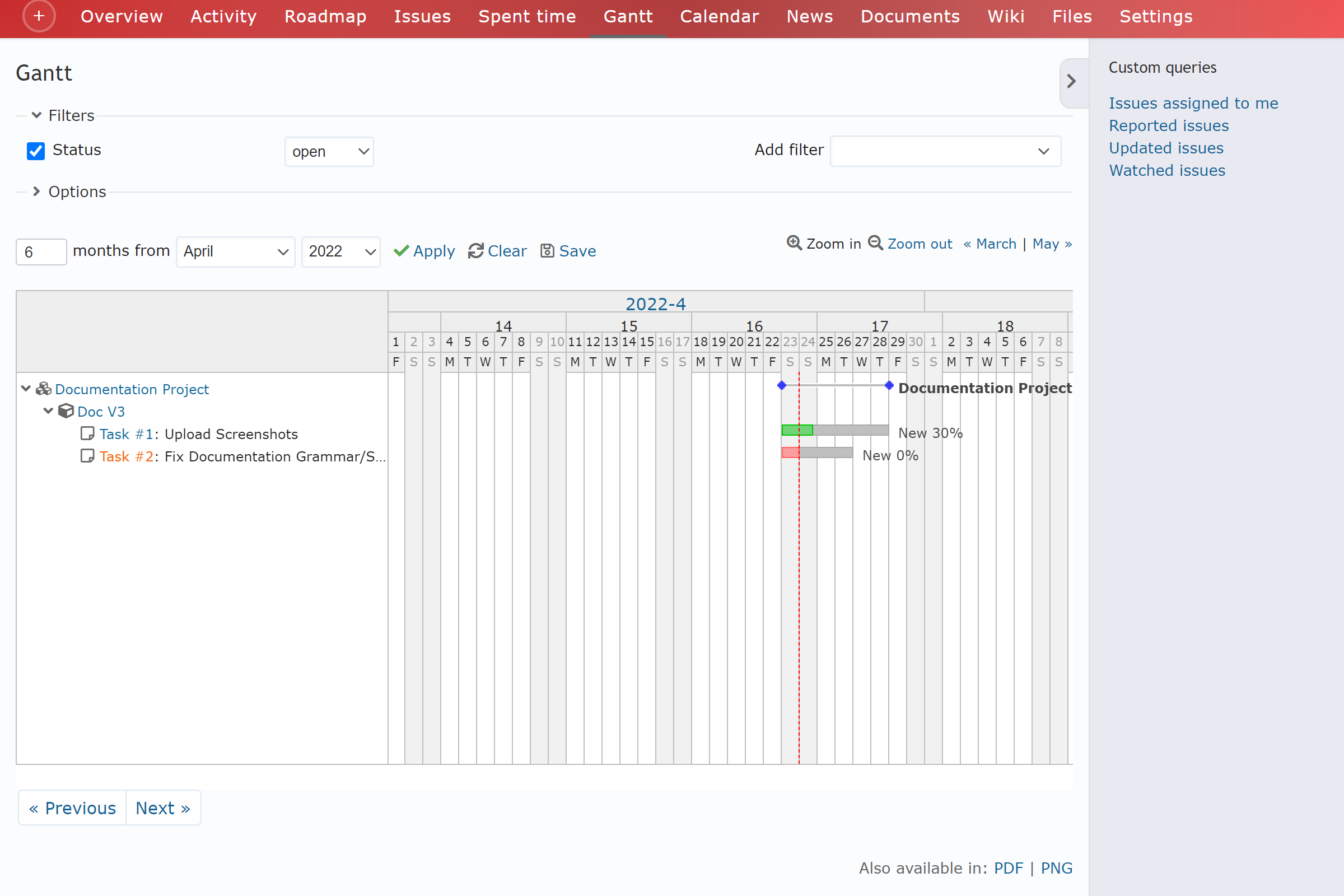
LOBSTA automatically generates a Gantt chart for the project. A Gantt chart displays the tasks of the project over time. You can apply custom queries too.

Interpretation
The gantt chart can be interpreted as follows:
- The Y axis is the task assigned, and X axis a time interval.
- The width of a bar represents the duration for a task.
- Each bar shows the project status as well as % done.
- The vertical order these bars are displayed represents their dependencies to each other.
- Each bar has colors representing % done. Green represents the amount of % done and red the remaining amount to be completed.
Gantt charts on LOBSTA displays the following tasks:
- Project Version
- Issues
- Sub Issues
Options
You can manage how the gantt chart is displayed to you.
- You can select the range of months from month and year you want to see
- Can zoom in or zoom out to view more months at a time.
- Can manually move the months by clicking on < month | month > to go to the preceding or following month.